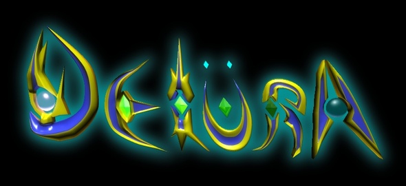
Easier said than done., I have some issues with the current design shown below that really needs to be resolved.

Hello. I also like looking at illuminated screens as well as pressing buttons. We have a lot in common!
Age 41
Animator
Tanadrine Studios
Joined on 12/31/06
Posted by Tanadrine-Studios - February 6th, 2013
Easier said than done., I have some issues with the current design shown below that really needs to be resolved.

Jewel encrusted words... it can work, just thinking they have to be roughly the same size (aside from the 'D') The 'L' could be more of a longer shoe and not so high-heeled.
Maybe alien calligraphy (2D) using all the same elements might be more aesthetically pleasing?
Thanks for the suggestions! I'll post my updates on the title here as I keep working.
...or just rotate it left a few degrees.
Mabelma
The colors are nice but I think the design is a little bit messy. Maybe just go back to pencil and paper and try to sketch it out first, go for something simple but readable then add all the little effects and what nots. Best of luck with it :)
Tanadrine-Studios
I'm going to try to salvage this design first... see if I can't fill it out and make it less chaotic. If it comes to the very worst, it'll be back to the pencil/paper... or a delay in the title redesign.